Thursday, 26 March 2015

Title experiments: photocopying type to make wobble effect


Potential idea for our landing page
  • might be hard to make cohesive with other elements
  • adds motion- one of our words
  • typographic element


Wednesday, 25 March 2015

gallery page development


  • Reverse border gradient works really well – gives the design some life
  • Black overlay, and the image will become clearer when the user hovers over the images
  • Purple and orange gradient isn't working however. Too much contrast and in danger of looking like clip art. 
  • The gradient needs to flow nicer to give the illusion of light

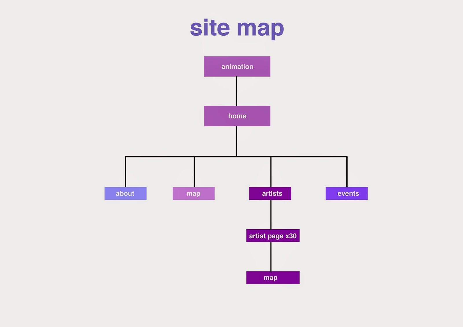
Site map


We wanted to keep our final site map as simple as possible to assure easy navigation for the viewer. The animation will start, then roll into the home page, which will then provide clickable options such as map, artists and events. The artists page will provide links to info about all the different artists and a small map of where to locate their installation.

moire test/idea for animation


We began looking at different ways to do our animation, to reflect our word 'Motion'. One idea we came up with was moire patterns. We liked this idea because it is an animation you can make physically and digitally.

We tested this idea by printing the patterns on ohp paper and physically sliding them together

We agreed this will work well for an animation which leads into our home page. Thinking of testing  this on after effects

Tuesday, 24 March 2015

About page

We have experimented with gradients at big type while making the about page. We prefer the bolder type, and like the reversed gradients as it helps give the page more depth.

Monday, 23 March 2015

Inspiration: Green Man Festival website


http://www.greenman.net

We like the Green Man festival website, due to it's animation, hover states, easy navigation and strong style/aesthetic.

We could potentially add some of these components to our website, especially parts like the hover state musicians/line up page and the starting animation

Sunday, 22 March 2015

Concepts


  • needs to be more consistent
  • geometric lines are good and use of gradient reflects light festival really well
  • Bottom concept works the best
  • Needs grid & structure