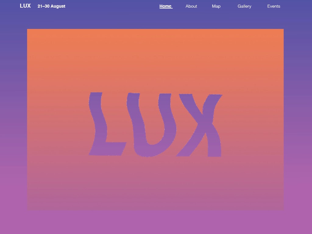
Tuesday, 31 March 2015

Further refinements and tweaking final pages


  • Need to make sure our grid is consistent (3 panels)
  • Keep spacing the same between text and images
  • Underlining needs to stay the same
  • About page - unnecessary as the about information is already on the home page
  • Keep usability up

Monday, 30 March 2015

mobile tests


  • type is hard to read – do we even need that info on the mobile home page?
  • large imagery is working
  • keep spacing and grid tight
  • simplify right down


Saturday, 28 March 2015

final moire animation


Our final animation which will play when the website starts – this will then lead onto the home page
See-saw effect gives illusion to the viewer (they won't know that its lines running into each other)

Friday, 27 March 2015

Landing page concept


Using the lux images that we created on the photocopier, we placed it with a gradient using black, white and knockouts as experiments. We like the graphic impact that it has, as well as the movement, however we realise that it doesn't convey anything about a light festival and is confusing having it on the home page because it is not the lux logo.

Creating the map

Inspiration for map:


We were inspired the colour scheme of the map, and how the subtle neon graphics luminate against the grey areas. To incorporate this into our map, we are using the same grey colour scheme for the area, buildings and roads, and creating a luminous path of where the Lux light works are located at.


I traced the outlines of the Lux map on illustrator in order to create an accurate map:    


I then included type and a gradient pathway to indicate where the Lux light works are located at. I have also used the map inspiration as a guide for the colour scheme of our map. The use of contrast helps the user to easily identify the main areas that they have to go to:


moire test - after effects


Making moire pattern on after effects. 
  • make pattern seesaw instead of going back and forth
  • too white, doesn't reflect light festival enough
  • fix awkward ending


Thursday, 26 March 2015

Title experiments: photocopying type to make wobble effect


Potential idea for our landing page
  • might be hard to make cohesive with other elements
  • adds motion- one of our words
  • typographic element