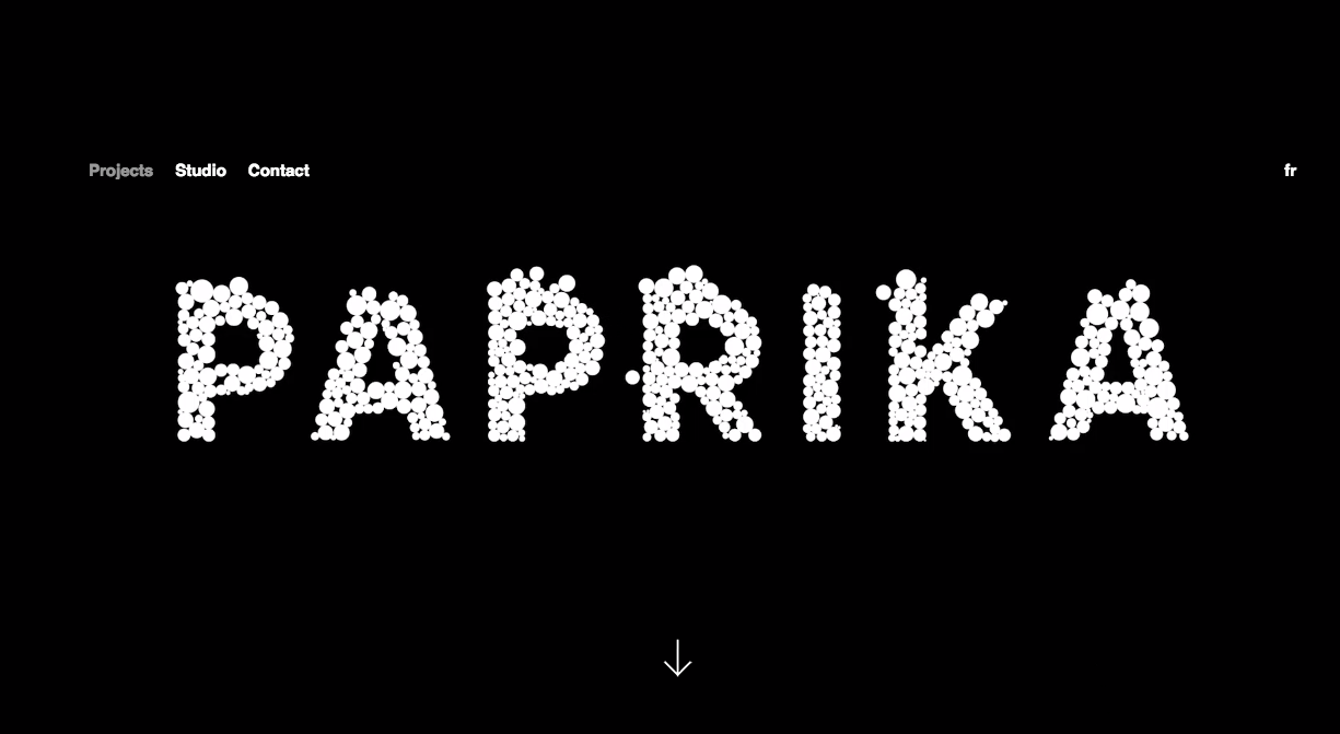
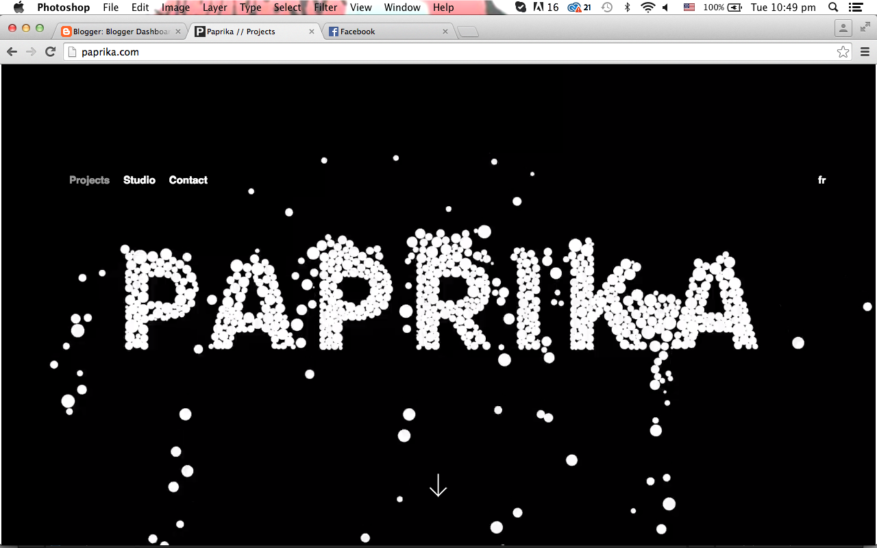
Tuesday 31 March 2015

Further refinements and tweaking final pages


  • Need to make sure our grid is consistent (3 panels)
  • Keep spacing the same between text and images
  • Underlining needs to stay the same
  • About page - unnecessary as the about information is already on the home page
  • Keep usability up

Monday 30 March 2015

mobile tests


  • type is hard to read – do we even need that info on the mobile home page?
  • large imagery is working
  • keep spacing and grid tight
  • simplify right down


Saturday 28 March 2015

final moire animation


Our final animation which will play when the website starts – this will then lead onto the home page
See-saw effect gives illusion to the viewer (they won't know that its lines running into each other)

Friday 27 March 2015

Landing page concept


Using the lux images that we created on the photocopier, we placed it with a gradient using black, white and knockouts as experiments. We like the graphic impact that it has, as well as the movement, however we realise that it doesn't convey anything about a light festival and is confusing having it on the home page because it is not the lux logo.

Creating the map

Inspiration for map:


We were inspired the colour scheme of the map, and how the subtle neon graphics luminate against the grey areas. To incorporate this into our map, we are using the same grey colour scheme for the area, buildings and roads, and creating a luminous path of where the Lux light works are located at.


I traced the outlines of the Lux map on illustrator in order to create an accurate map:    


I then included type and a gradient pathway to indicate where the Lux light works are located at. I have also used the map inspiration as a guide for the colour scheme of our map. The use of contrast helps the user to easily identify the main areas that they have to go to:


moire test - after effects


Making moire pattern on after effects. 
  • make pattern seesaw instead of going back and forth
  • too white, doesn't reflect light festival enough
  • fix awkward ending


Thursday 26 March 2015

Title experiments: photocopying type to make wobble effect


Potential idea for our landing page
  • might be hard to make cohesive with other elements
  • adds motion- one of our words
  • typographic element


Wednesday 25 March 2015

gallery page development


  • Reverse border gradient works really well – gives the design some life
  • Black overlay, and the image will become clearer when the user hovers over the images
  • Purple and orange gradient isn't working however. Too much contrast and in danger of looking like clip art. 
  • The gradient needs to flow nicer to give the illusion of light

Site map


We wanted to keep our final site map as simple as possible to assure easy navigation for the viewer. The animation will start, then roll into the home page, which will then provide clickable options such as map, artists and events. The artists page will provide links to info about all the different artists and a small map of where to locate their installation.

moire test/idea for animation


We began looking at different ways to do our animation, to reflect our word 'Motion'. One idea we came up with was moire patterns. We liked this idea because it is an animation you can make physically and digitally.

We tested this idea by printing the patterns on ohp paper and physically sliding them together

We agreed this will work well for an animation which leads into our home page. Thinking of testing  this on after effects

Tuesday 24 March 2015

About page

We have experimented with gradients at big type while making the about page. We prefer the bolder type, and like the reversed gradients as it helps give the page more depth.

Monday 23 March 2015

Inspiration: Green Man Festival website


http://www.greenman.net

We like the Green Man festival website, due to it's animation, hover states, easy navigation and strong style/aesthetic.

We could potentially add some of these components to our website, especially parts like the hover state musicians/line up page and the starting animation

Sunday 22 March 2015

Concepts


  • needs to be more consistent
  • geometric lines are good and use of gradient reflects light festival really well
  • Bottom concept works the best
  • Needs grid & structure


Thursday 19 March 2015

Gradients


We decided a great aesthetic component to our website would be gradients. This will work well for our words luminous and stimulating. We are also heavily referencing James Turrell. The light artist that inspired us at the beginning of this project.

Words


As a team we decided on Luminous, Motion and Stimulating as the words to inspire us though this project. From refining our moodboard down we felt that these words best describe the aesthetic we're interested in. We will try and reflect this through our design.

Friday 13 March 2015

starting about page


  • type is too large/clunky
  • the dark blue looks too 'clip-arty'
  • 'about' type is weird, however it is interesting and we could potentially play with type this way further through the project


Tuesday 10 March 2015

Paprika: Website Inspiration


http://paprika.com/


Paprika is a graphic design and strategic marketing firm specialising in business communications services.

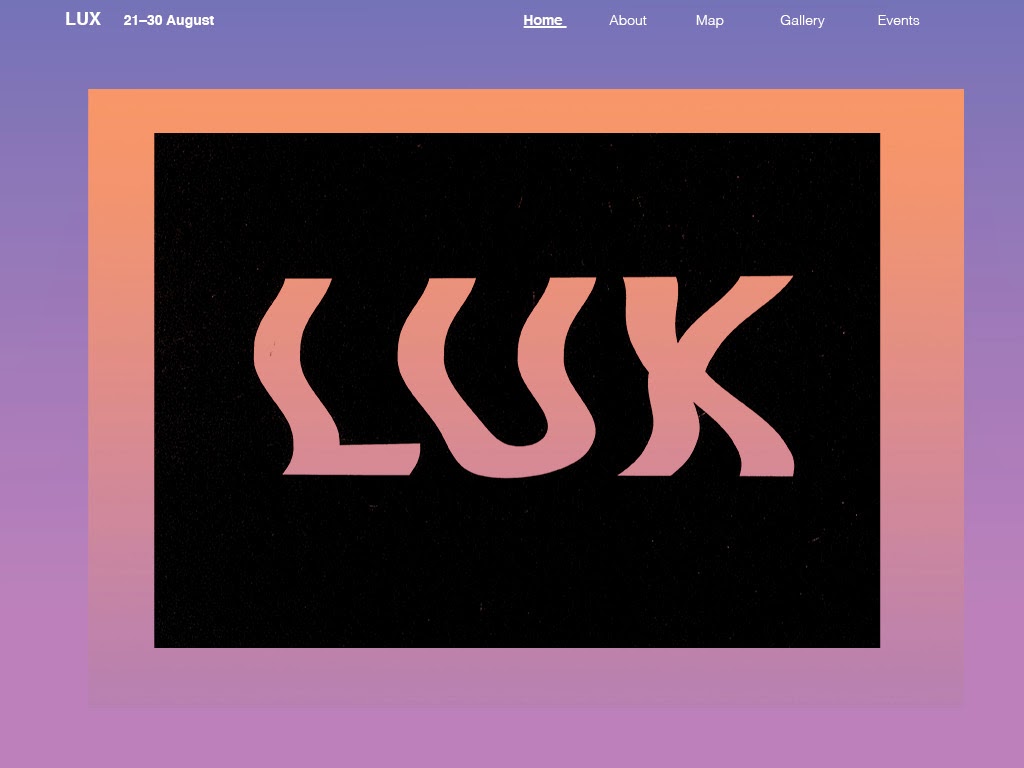
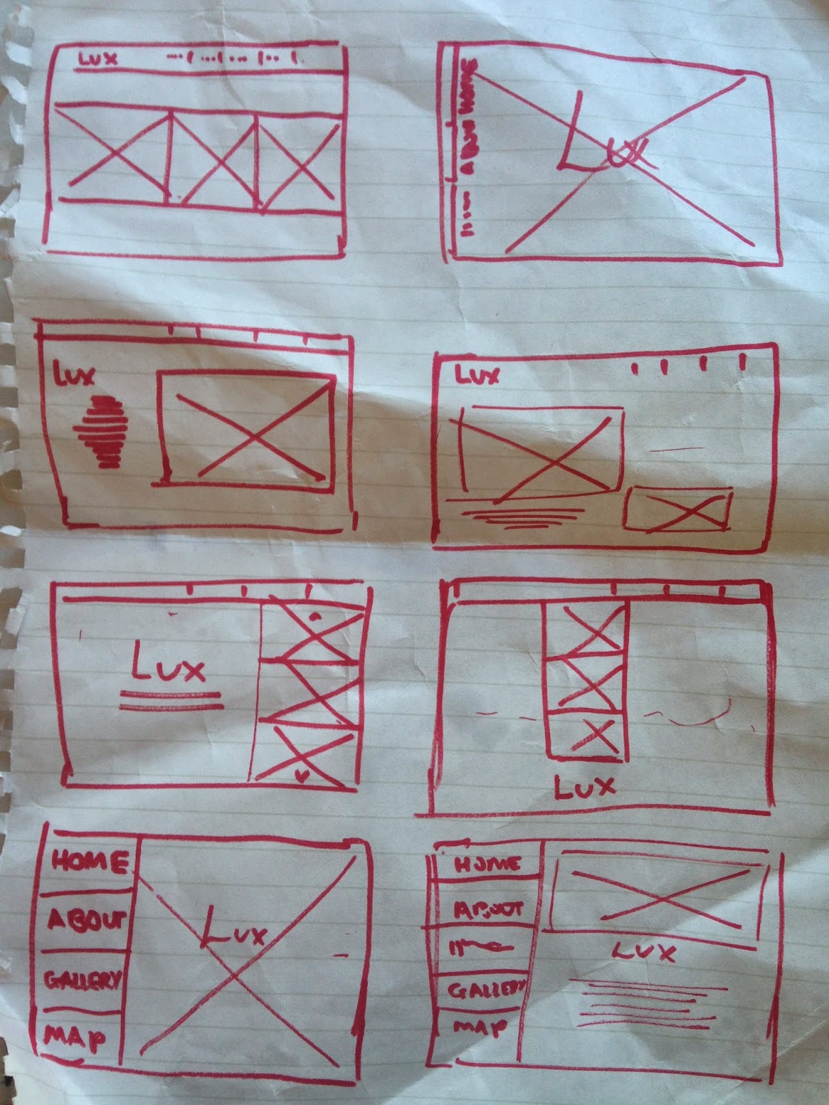
We selected this as an artist model, as we like how the website instantly captivates the viewer. When you load the page an animated graphic element will appear, The viewer is then guided down to the home page. You can only see the animation when you refresh the page and the animation style will change every time. We think this aspect is crucial to grabbing the audience's attention.

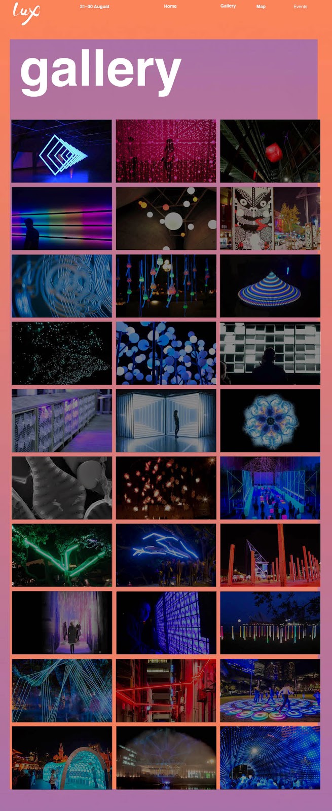
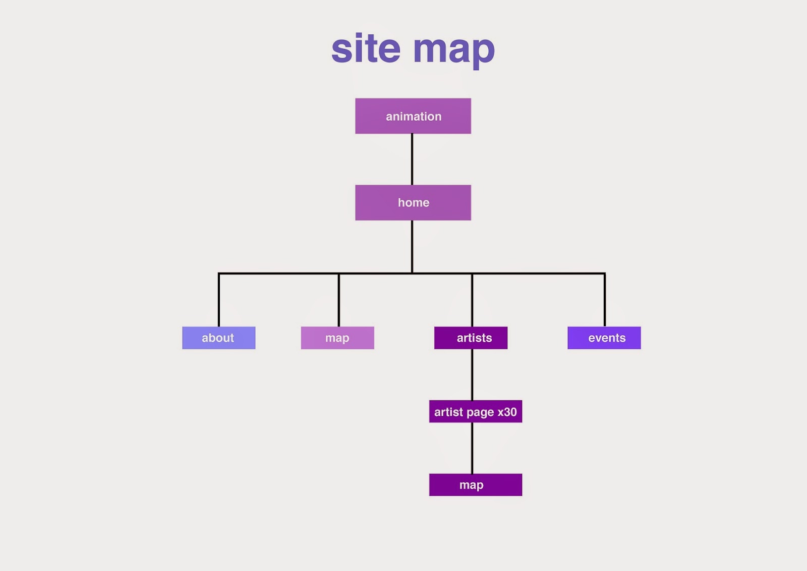
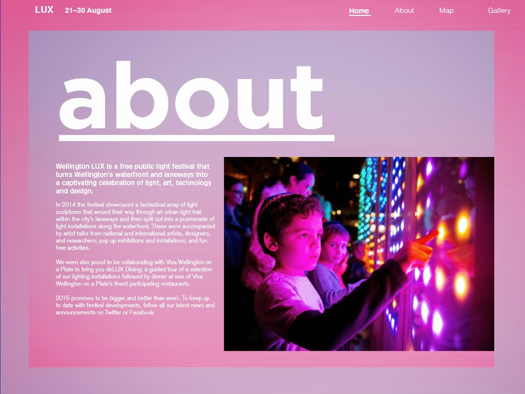
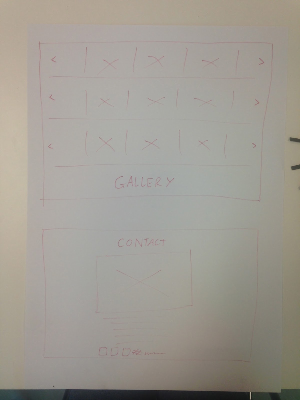
The rest of the website is laid out very minimal and simplistic. Basic grid layout and easy navigation. We like how the web designer has made the intro the exciting part then left the rest of the website clean, to allow an easy, clear understanding of the content.

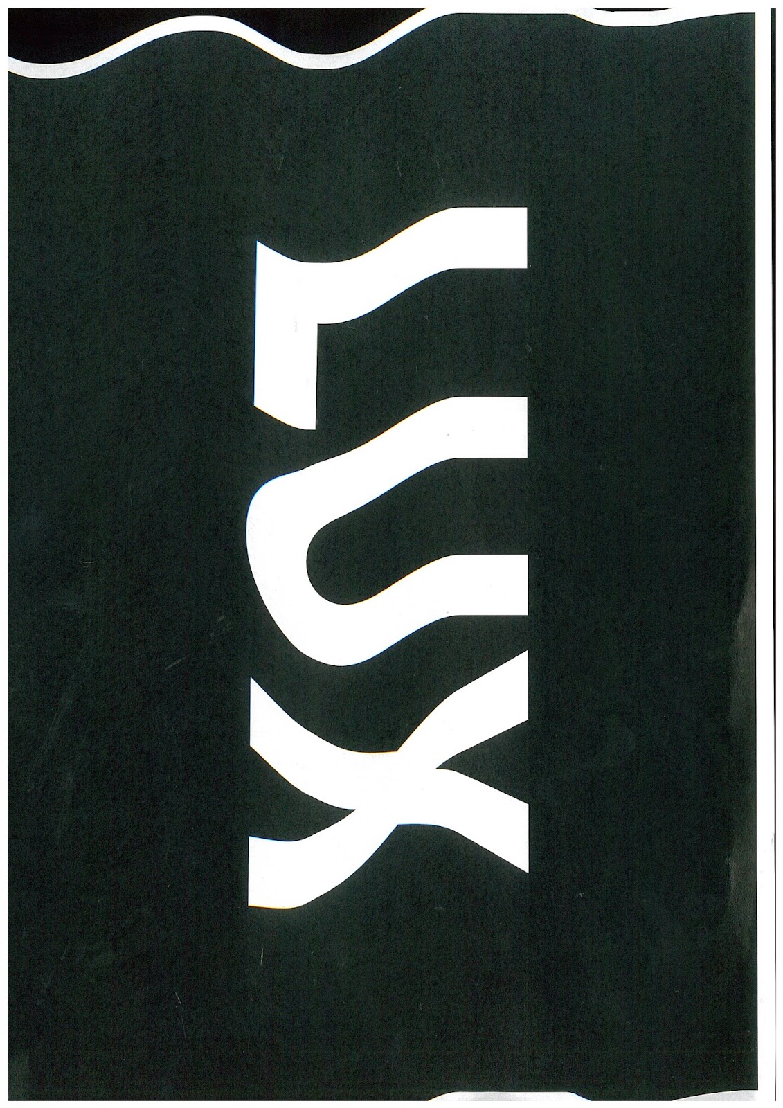
We feel that applying these attributes to the LUX website will effectively captivate the audience and appeal to many different demographics as it is impressive yet easy to navigate. This will effectively represent LUX as it is an impressive event, and we believe the website should reflect that.


Monday 9 March 2015

Planning the website as a whole

When creating the wireframes, we decided to keep the home page as a long scrolling page that will briefly summarise the page links in the navigation bar. This gives the user an idea of what to expect for the website/ Lux and is easier for them to process information


Gradient colour palette

In order to consistently use James Turell as our main inspiration to represent our terms 'stimulating' and 'luminous' , we wanted to experiment with incorporating gradient into our website effectively.


Thursday 5 March 2015

Wireframes

In  order to get an idea/feel of what our website will look like in terms of navigation and layout, we drew sets of wireframes for each page in order to see what they would potentially look like on screen.We wanted to portray the information in an interesting way, instead of aligning everything straight together, as we wanted to experiment with playfulness in type.

About page:

The arrangement of type and image is an important element for us , in terms of making it easier for the user to navigate across the page, as well as making the page look visually more exciting.


Gallery and contact page:

We were thinking of displaying the gallery in a grid format, so that all the artists are visible.


Home page:

Arranging imagery and incorporating the 'Lux' logo


When creating these wireframes, we were constantly aware of our target audience, due to the demographic users we used in class as an exercise to identify how to navigate our page to each users needs:


Target Audience

Identifying Lux' users


We identified Lux Light Festival's three main users as being:
  1. Families- Parents interesting in providing entertainments for the kids, way to escape home.
  2. Wellington Locals- Who are interested in joining a free event that is located in their city, stumble upon artists works, students, business professionals on their way home.
  3. Tourists- Away from home, exploring and experiencing Wellington at night from a different perspective.

When we identified these three main user groups, our next step was to design wireframes for our website that will help these three groups, and  guide them easily, but in different ways that engage them.

Wednesday 4 March 2015

Breaking down the mood board


From observing our mood board, we were given the task to describe our potential idea to redesign the Lux website in three words: 


  • Luminous - Evident from the inspiration of James Turell's works, and how he incorporates gradients and luminous colours and manages to make them flow well.

  • Motion-  Animation inspiration from the tracking page before the home page on websites. This will engage and excite the user, and help to incorporate interactivity on the website.

  • Stimulating- Inspiration from the use of colour, and the flow of gradients.


After applying these three terms to our mood board, we then broke down the mood board by choosing in order what the most important images are that represent our terms and intentions the best.